


Environmental Scientist

Social Worker

Social Worker

Machine Operator

Ecommerce Expert

Photographer


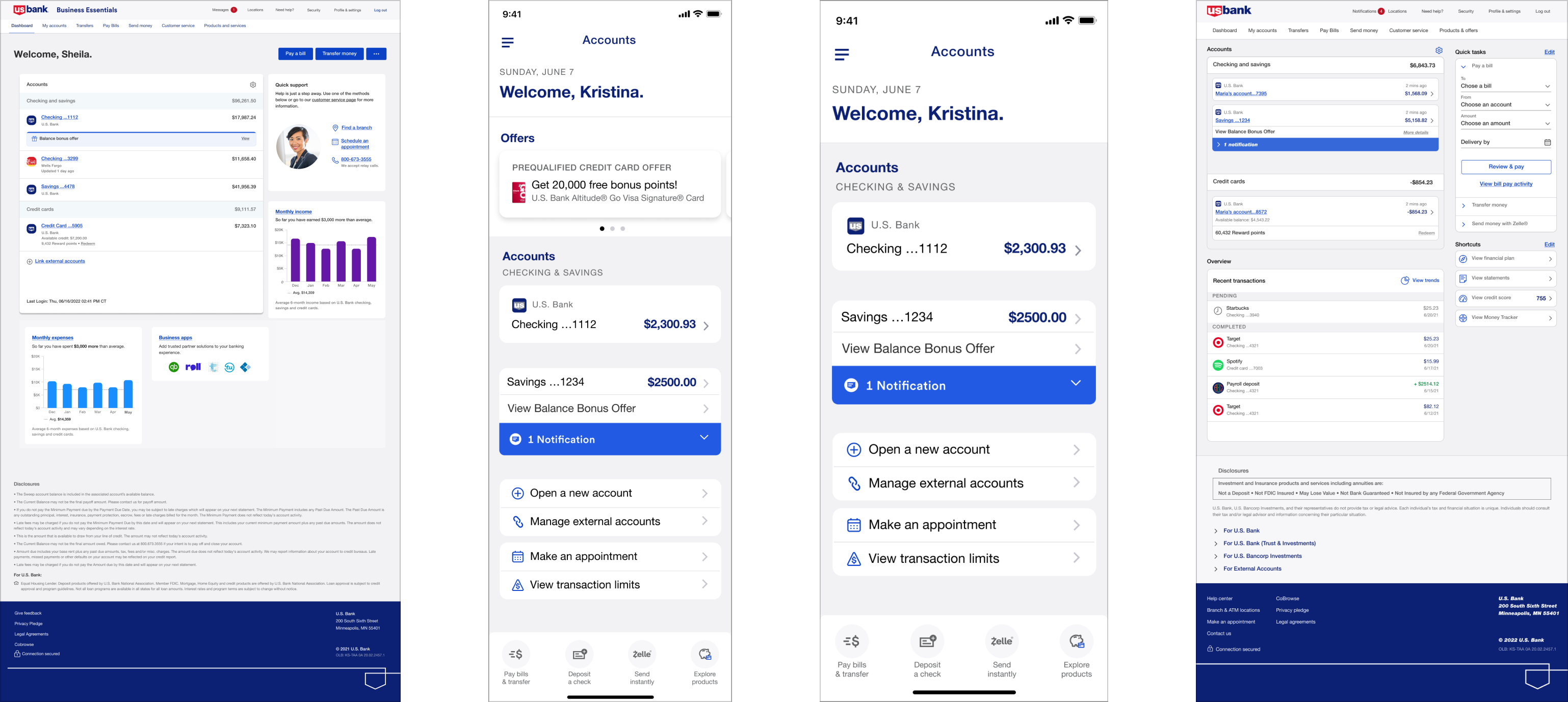
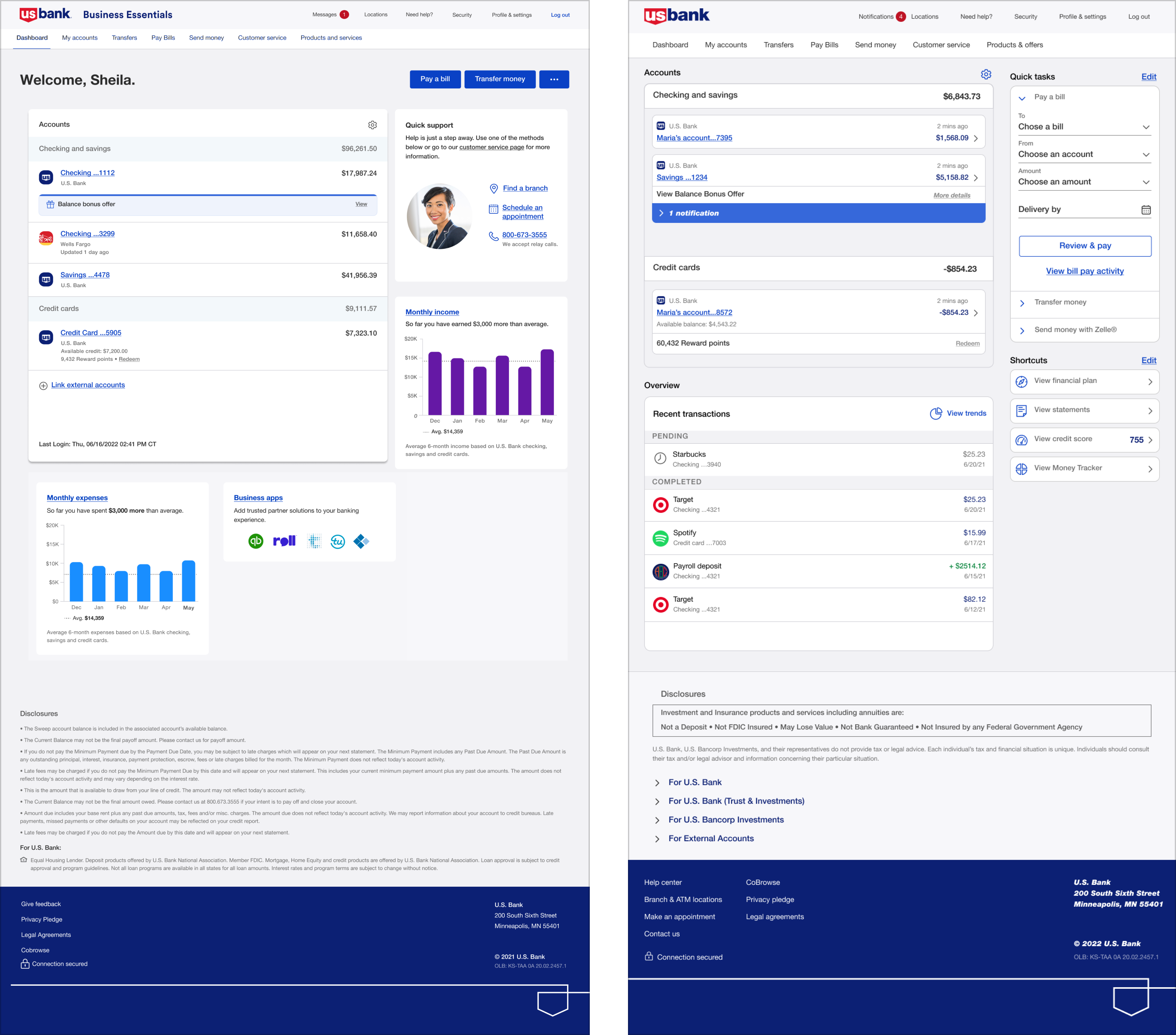

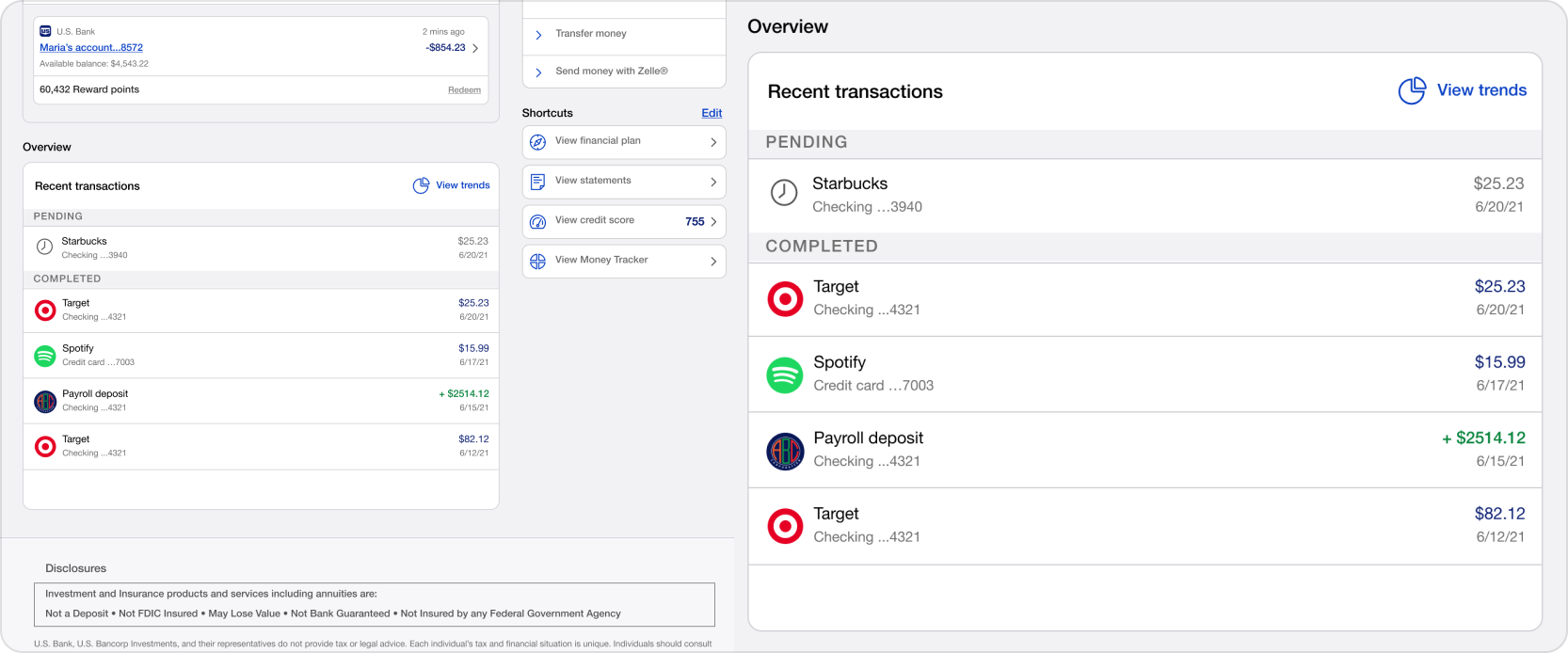
It is very good option to edit quick task.

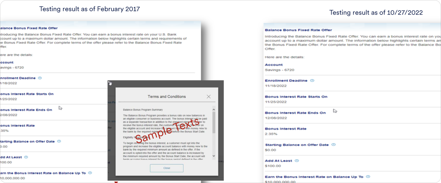
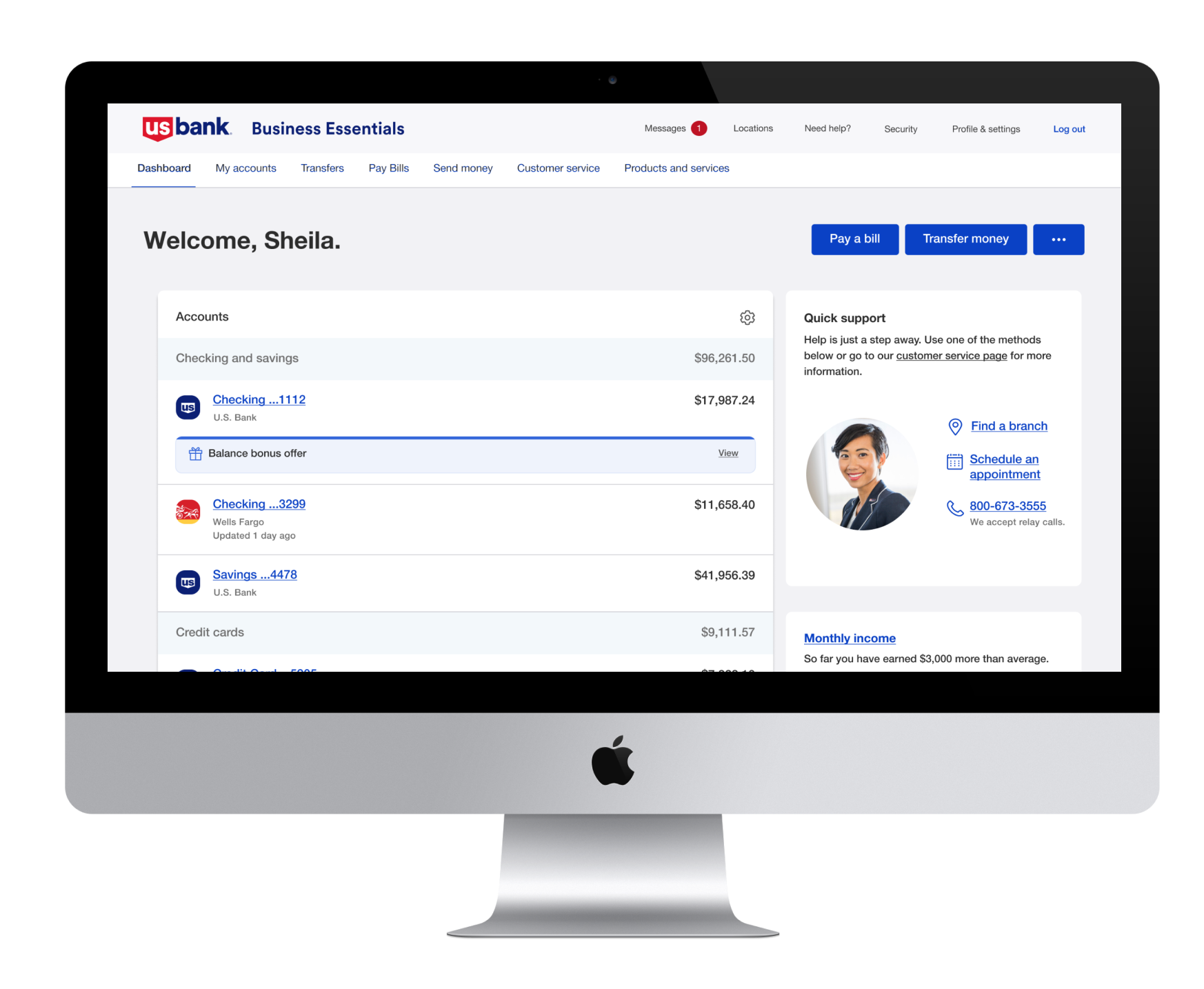
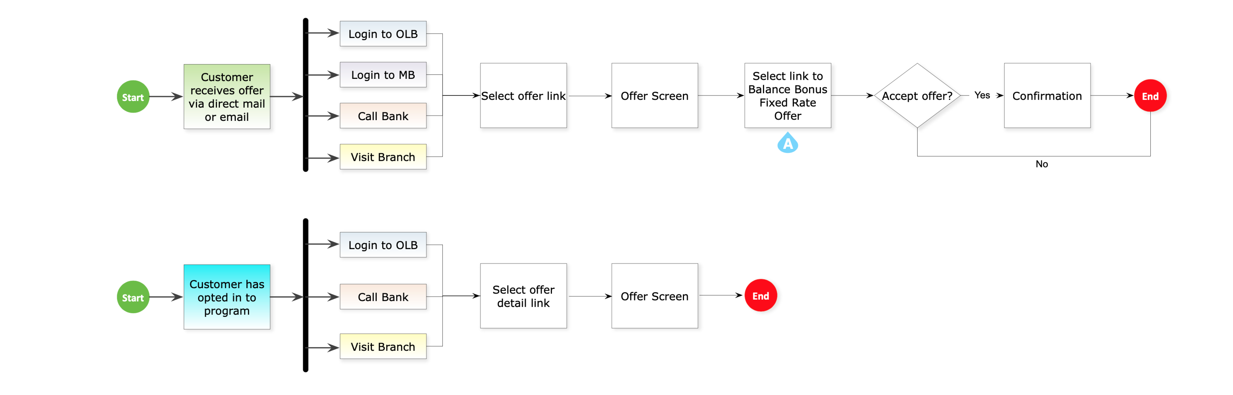
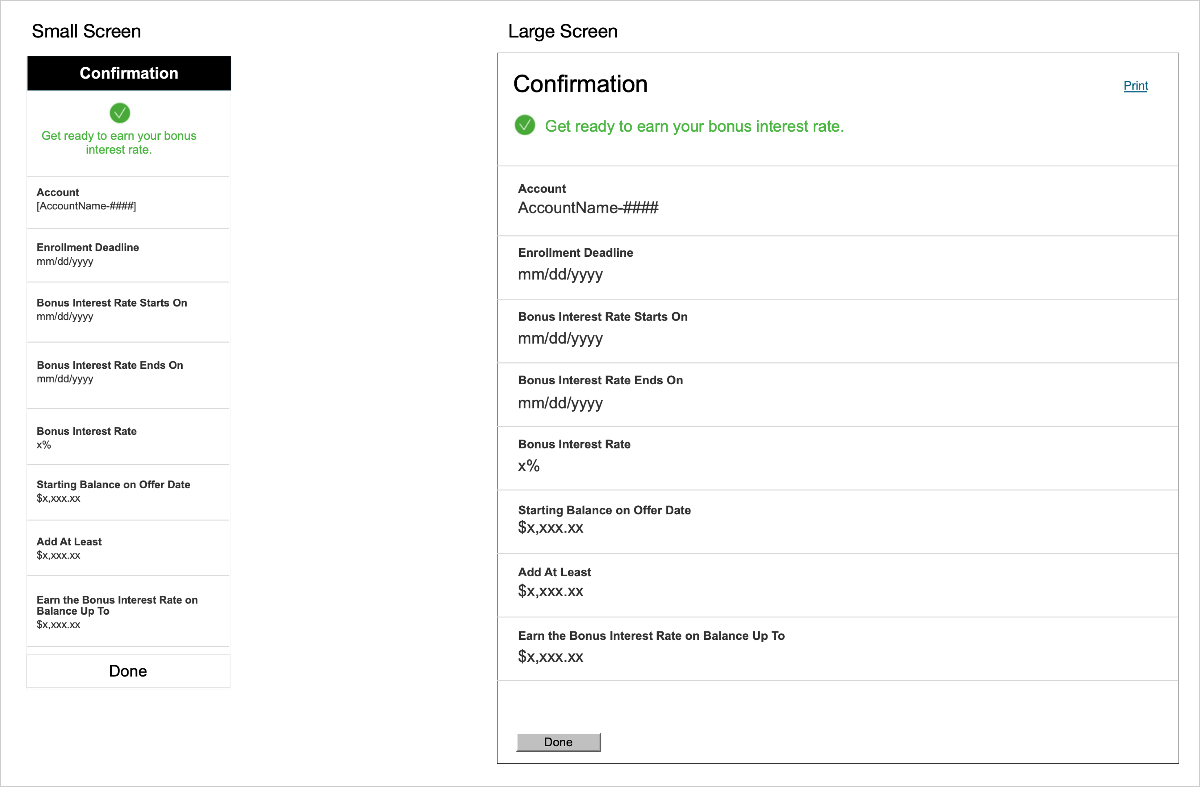
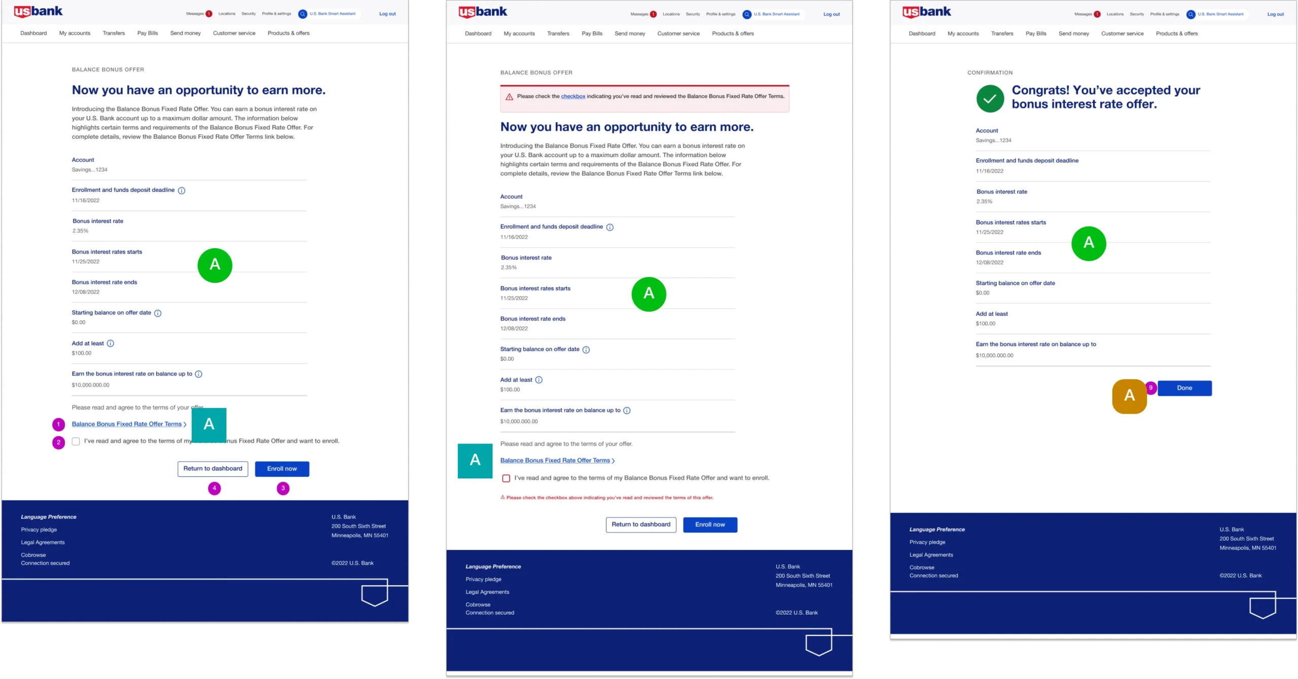
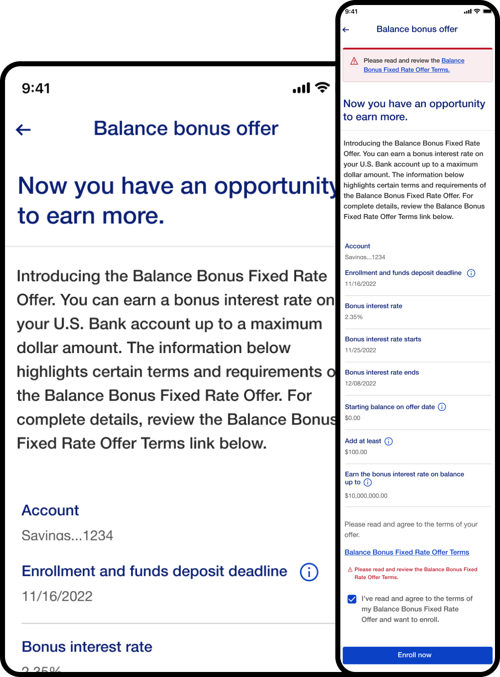
Only one offer is presented per account

Review & pay option is good for users to check their transfer before the task done.

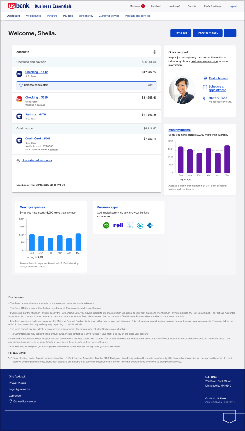
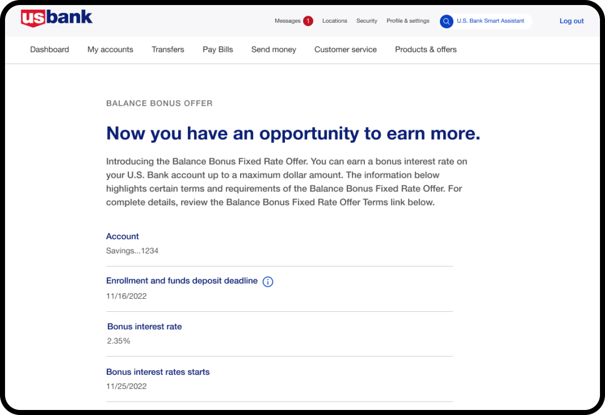
Front-end channels will need to display the offer

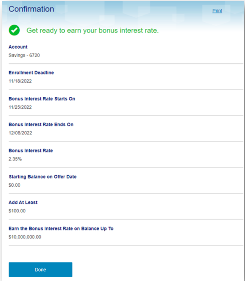
Offer is only available when CD is in its grace period

New MMA accounts should be divided into “pricing groups” for testing purposes
Only one offer is presented per account

Monetize payments and can Zafin identify customer payments and determine amount of cash payment